Icons Are a System, Not a Folder of SVGs
Consistent stroke weight, one grid, tree-shakeable imports, and the accessibility rule that decides whether an icon should be announced at all.
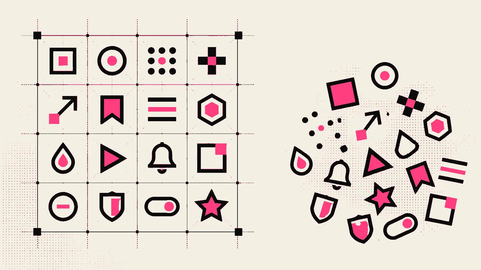
Icon inconsistency is the fastest way to make a careful design look careless. Two icon sets on one page differ in stroke weight, corner radius and optical size, and it reads as sloppiness long before anyone can name the cause.
The fix is to treat icons as a system with one source.
One set, imported individually
import { Search, ArrowRight, Check } from 'lucide-react'
<Search size={20} strokeWidth={2} aria-hidden="true" />Named imports tree-shake, so a page using six icons ships six icons rather than a font file containing a thousand. This is also why icon fonts are worth retiring: they load everything, they render as text (so they inherit text rendering quirks), and they break in ways that produce a stray glyph instead of a missing image.
Set your defaults once rather than per usage:
<IconContext.Provider value={{ size: 20, strokeWidth: 2, absoluteStrokeWidth: true }}>absoluteStrokeWidth keeps the stroke visually constant when icons are scaled — without it, a 48px icon looks thinner than a 20px one at the same nominal weight.
The accessibility rule, which is simpler than people think
Ask one question: does the icon carry information the text does not?
Decorative — the text already says it:
<button><Search aria-hidden="true" /> Search</button>Meaningful — the icon is the only label:
<button aria-label="Search"><Search aria-hidden="true" /></button>The icon itself is always aria-hidden; the button carries the name. An icon-only button with no accessible name is one of the most common findings in any audit, and it is one attribute away from being fixed.
Direction matters in bilingual UI
Directional icons flip in RTL — arrows, chevrons, "next", undo, indent. Non-directional ones do not: a clock, a search glass, a checkmark, a logo. Flipping everything is as wrong as flipping nothing, and it is what a blanket transform: scaleX(-1) on an icon class produces.
[dir='rtl'] .icon-directional { transform: scaleX(-1); }Opt in per icon. It is a five-minute pass that separates a properly localised interface from a mirrored one.
Why this set
Open source under a permissive licence, a genuinely consistent grid, and a community large enough that the icon you need on a Friday already exists. But the argument here is not really about which set — it is that picking one and enforcing it is worth more than the merits of any of them.
Resources
- Repo: lucide-icons/lucide
- Docs: lucide.dev
- Video walkthroughs: YouTube: lucide icons react setup
- Related: Radix Primitives: behaviour without the look
Need this built properly?
I build secure, fast, bilingual platforms for clients across Egypt, Saudi Arabia, the UAE and Kuwait.